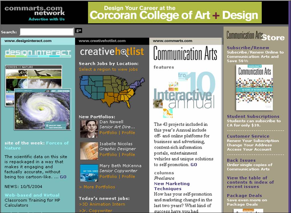
Proximity – Each of the four columns share a focus on the front page of the site. All four columns are close in terms of their location on the page, and they all are congruent with each other to form solid content organization. When I view the page, my eye goes directly to the image and header of each column. For example, my eye first went to the the map of the United States on the “Creative Hotlist” section. From there, my eye goes downward to the information listed below. The result is that my eye stayed focused on the information that was listed in the column not the information in other directions of the site. That’s impressive because there is a lot of categorized information on this page.
Alignment – The organized grid and the organized layout of the page achieves great alignment for the site. Each section’s information is organized for the reader, and each section has a picture or image to help emphasize it’s content. My eye focused upon the image of each column, which allowed me to stay focused on the information that the column is trying to convey. With the images placed in each column to emphasize each column’s content, the column’s content emphasis was more decipherable. As a viewer, finding information is much more accessible than searching across the page for information through links and short content blurbs.
Repetition – The four columns listed on the page creates a unified presence for network’s site. The four columns are proportioned evenly, and the bright colors of the “Design Interact” and “Communication Arts” columns give emphasis to it’s separate content. It’s great for the network because no one partner’s column outshines the other partner on the network’s page. The repetition of the images allows for a unified introduction to each column’s content.
Contrast – The focal point for each column is centered upon an image introducing each column’s content. This displays a solid form of organization and unity. The contrast of color from light blue, to dark gray, to white, to light grey, not only focuses your eye to the content, but it also draws your eye downward. The result is that your eye stays focused on the information contained in the section. It’s difficult for your eye to dart across the page in a search for isolated information.
The Communication Arts Network’s use of columns unifies content in a well-organized fashion. The images help guide a viewer’s interests to each column’s content, and the colors give enough contrast to keep the viewer’s eye from straying to other sections of the site. The similarity of the column’s sizes doesn’t emphasize one section over another section, which is important, because the column’s sizing similarities allow for the whole network to be emphasized not just one section. If the emphasis of each partner is equal then the site can display each partner’s benefits in a more powerful and equitable manner.
The site also has condensed the content together to create well-placed and unified grid for the viewer. This is a great viewing for a person, who is either exploring the network or is visiting the site for an introduction. I wish that a lot of portals, networks, or corporations could use this page for reference when they re-design the layouts of their sites.
BD
Bret Dougherty 10/1/04